


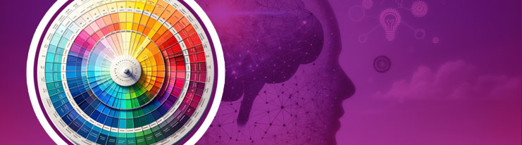
Colour, often a subtle and understated hero in the realm of marketing, wields a power that transcends mere visual appeal. In print marketing, where every element contributes to brand storytelling the choice of colour holds huge importance.
Whether it’s the shades on book covers or the professional tones on business cards, colours silently engage with the audience and create a profound connection. For marketing professionals and graphic designers, understanding the psychology behind these colour choices is not just an artistic endeavour but a strategic one. We’ll go on to explore the captivating realm of colour psychology in print marketing, revealing how specific palettes can transform books, booklets, document folders and business cards into powerful communication tools.
Table of Contents:
- The Psychology Behind Colours
- Colour and Brand Identity
- Choosing the Right Colours for Different Print Materials
- Colour Trends in the Print Industry
- Psychological Effects of Specific Colours
- Best Practices in Colour Selection for Print Marketing
- Conclusion
The Psychology Behind Colours
Colour psychology recognizes that colours are more than preferences; they have the ability to evoke emotions and influence decision making processes. The impact of colours stems from meanings, personal experiences and even biological conditioning. For example blue often brings about feelings of calmness and trust while red can elicit excitement or urgency. This emotional connection holds huge significance in print marketing. Choosing a colour well for a booklet can engage the reader, whereas a well-chosen colour on a document folder can convey professionalism, and the right shade on a business card can leave a long-lasting first impression.
Understanding the psychology of colours starts with recognizing their two components; the “warm” and “cool” spectrum. Warm colours, such as reds, oranges and yellows are often associated with energy, passion and happiness. These vibrant hues have a way of catching our attention and can be effective in creating a sense of urgency or drawing focus to messages. On the other hand cool colours like blues, greens and purples tend to evoke feelings of calmness, trustworthiness and stability. These shades are particularly useful for establishing a sense of security and reliability – qualities that are crucial for brands aiming to build trust and long term relationships with their audience.
When delving into the realm of colour psychology it’s essential to consider its roots and cultural variations. Colours have played roles in cultures throughout history, often carrying symbolic meanings. For instance in certain Eastern cultures red is seen as a symbol of luck and prosperity; whereas in Western cultures it may represent passion or danger.The cultural aspect plays a key role in print marketing because it influences how different audiences perceive colours.
Furthermore the psychological impact of colour extends to its shades and tones. A vibrant red can convey excitement while a darker shade may suggest sophistication or even aggression. It’s fascinating how the same colour, but in different shades can elicit diverse reactions. Marketers and designers must carefully consider these factors when selecting colours for printed materials.
Colour and Brand Identity
Colour and its connection to brand identity are incredibly significant. A brand’s chosen colour scheme becomes its identity, serving as a way to communicate its values and personality. Just think about how recognizable the green on a Starbucks cup or the red and yellow of a McDonalds sign is. These colours are not just part of their logos; they are deeply ingrained in their brand identities.
Consistent use of colour in print marketing aids in building brand recognition. By maintaining this consistency across items like book covers, booklets, packaging, leaflets, document folders or business cards the brand becomes easily identifiable at a glance. However choosing the correct colour for a brand goes beyond picking something eye-catching; it requires an understanding of the brands message, target audience and desired emotional response.
Let’s consider a luxury brand that incorporates black into its print materials, such as high end booklets and elegant business cards. The use of black reinforces the brands sense of sophistication and exclusivity which appeals to their target audience. On the other hand, if we look at a sustainability brand, they might opt for greens and earth tones in their marketing materials. This choice aligns with their commitment to nature and environmental friendliness.
Speaking further about the relationship between colours and brand identity, let’s explore the aspects that make certain colour choices more impactful than others. Take blue for example which is commonly used in logos and print materials of banks and technology companies. This isn’t by chance; research in colour psychology suggests that blue communicates trustworthiness and reliability – qualities highly valued within these industries. Likewise green is often associated with organic and natural brands due to its connotations of health and tranquillity.
However brands sometimes deviate from these colour associations either to stand out from competitors or to align with a brand message. A luxury brand may choose a colour like purple to differentiate themselves while evoking notions of royalty and exclusivity.
Choosing the Right Colours for Different Print Materials
When it comes to selecting the colours for print materials it becomes an art beyond just branding, it becomes something specific to each print material’s purpose. Different types of materials such as books, booklets, document folders and business cards all have differing purposes, and each purpose requires consideration when selecting colours.
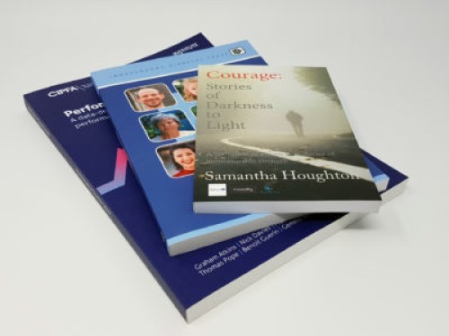
When it comes to books, the cover plays a significant role in capturing the reader’s attention. The right choice of colour can attract interest and set the tone for the content within. For example a children’s book might use colours to create a sense of fun and excitement. On the other hand, a business book might prefer subtle and professional tones. Other techniques such as Spot UV or Foiling may also be used to draw attention to specific elements on the cover.
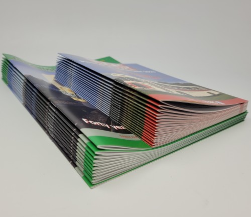
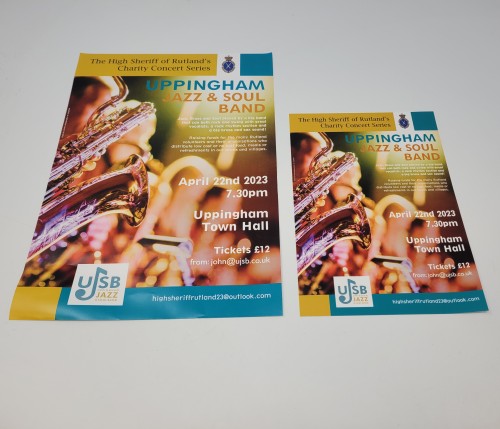
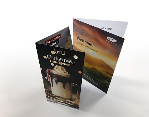
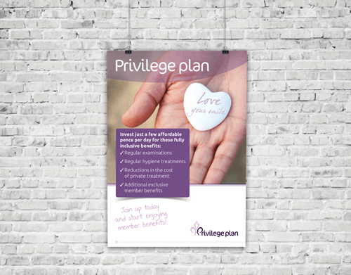
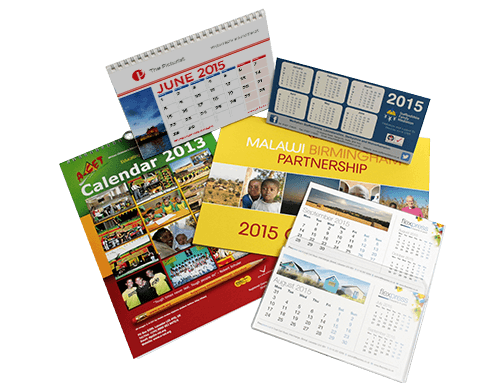
Booklets are commonly used for marketing and purposes. It’s important to choose colours that align with the brand’s identity while also ensuring readability and engagement. Contrasting colours can be employed to emphasise information while background colours should complement rather than overshadow the text.
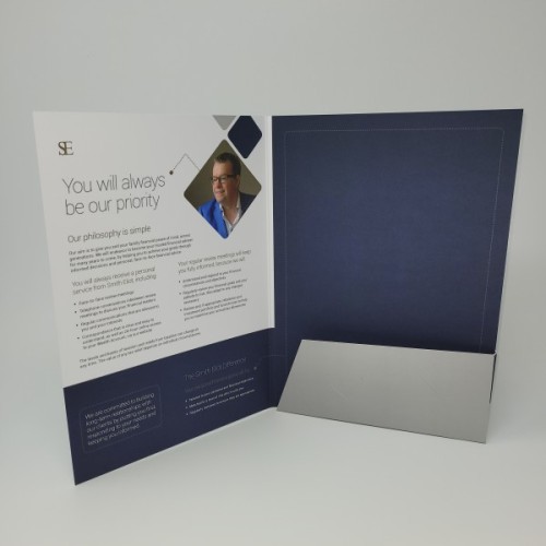
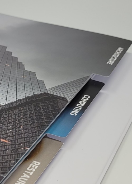
Document folders, very common in professional settings, often require a more conservative approach to colour. Subtle shades, like navy blue, grey or burgundy can convey professionalism and credibility effectively. However adding a touch of colour to highlight the company logo or other design elements can make the folder both functional and memorable. Again, highlighting specific colour or design elements with effects like Spot UV may also help cement a brand in somebody’s mind.
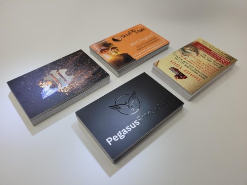
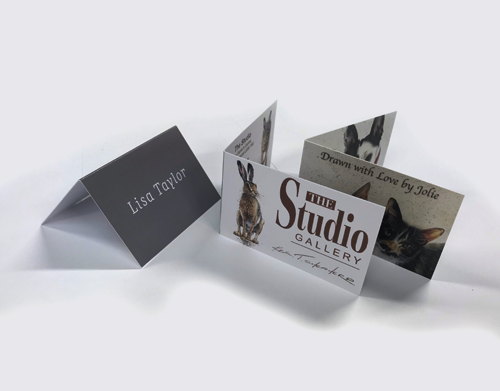
Despite their smaller size, business cards also have a large impact. The chosen colours should reflect the brand’s identity and help the card stand out in a stack. A technology company may opt for sleeker tones to represent innovation while a wellbeing brand might choose calming shades of blue and green.
When selecting colours for printed materials it is important to also consider the context in which they will be used. For example a booklet intended for a trade show may employ more attention grabbing colours when compared to a booklet designed for office use. Likewise the colour choices for business cards can vary based on the industry. A creative professional such as a designer might utilise vivid colours to showcase creativity while a lawyer may prefer more subdued tones to convey professionalism and seriousness.
The texture and quality of the material also play a role in how colours are perceived. A glossy finish can enhance the vibrancy of colours while a matte finish provides a more subdued appearance. This relationship between colour and material greatly influences the effectiveness of your print marketing materials.
1. Understand the purpose and target audience of your printed material.
2. Select colours that align with your brand’s identity and message.
3. Consider readability and visual appeal when dealing with items such as booklets and folders.
4. Utilise colour to create an impression that’s memorable and distinctive particularly on business cards.
Colour Trends in the Print Industry
The importance of keeping up with colour trends in the print industry cannot be overstated. It demonstrates a brand’s awareness of current styles and consumer preferences which is crucial for effective print marketing. Colour trends can arise from various places, including fashion and interior design and shifts in society and culture.
Currently, there has been an inclination towards vibrant and bold colours in print materials. These eye-catching shades tend to grab attention and convey a sense of dynamism and innovation. Additionally pastel colours have experienced a resurgence in popularity, often used to create an atmosphere of tranquillity, simplicity and nostalgia.
Furthermore sustainability and eco friendliness are becoming factors in colour trends. Many brands are opting for tones and textures in their print materials to reflect their commitment to the environment, while resonating with an increasingly growing environmentally conscious consumer base.
When examining the bigger picture, colour trends within the print industry frequently mirror societal trends. For example the growing trend of minimalism in design has led to an increase in monochrome and neutral palettes and colour schemes. This aligns with society’s preference, for simplicity and clarity – a preference that brands have readily incorporated into their print materials.
Another noteworthy aspect to consider is how technology impacts colour trends. Advancements in printing technology have expanded the range of colours readily available to marketers. Technology has made complex colour combinations more accessible and cost effective to print. This technological progress has unlocked opportunities for impactful utilisation of colour in print marketing.
Psychological Effects of Specific Colours
Understanding the effects associated with colours can prove valuable when using them within your print marketing;
Red: It evokes excitement, passion and urgency. Ideal for attention grabbing headlines and compelling calls to action.
Blue: This colour is associated with trust, stability and professionalism making it a popular choice for financial brands.
Green: Symbolising nature, growth and health it is a good fit for brands focusing on wellness, sustainability or organic products.
Yellow: Conveys optimism and youthfulness – excellent for children’s products or brands aiming to appear accessible and friendly.
Purple: Often linked to creativity, luxury and sophistication – suitable for brands seeking to convey elegance or artistic excellence.
Orange: A dynamic blend of red’s energy and yellow’s happiness. It possesses versatility and playfulness while stimulating creativity and enthusiasm.
Black: Represents power, elegance, formality – a choice for luxury brands offering high end products.
Each colour evokes its own connotations. It’s crucial for marketers and designers to grasp these associations in order to make well informed decisions that align with their brands message and meet their audiences expectations.
When delving into colours it’s fascinating to observe how subtle variations can impact perception. For instance while light blue is often perceived as refreshing and friendly, navy blue conveys professionalism and stability. Likewise a vibrant, lemony yellow can evoke energy and playfulness whereas a deeper gold might be seen as traditional and associated with wealth.
Understanding these nuances empowers marketers and designers to finetune their colour choices in order to elicit the desired response. It goes beyond the colour itself; considerations such as shade, tone and context play role too.
Best Practices in Colour Selection for Print Marketing
Making colour choices in print marketing entails more than understanding psychology or following trends. It involves applying a set of practices that ensure the selected colours effectively communicate your brand’s message while appealing to your intended audience.
Consistency is Key: Maintaining a colour palette across all printed materials helps establish an easily recognizable brand identity.
Know Your Audience: Different demographics and cultures can have varying reactions to colours. Understanding your target audience’s preferences and perceptions is crucial in any marketing endeavour.
Test and Get Feedback: Before finalising a colour scheme it’s important to gather feedback by conducting focus groups or surveys. This valuable input can provide insights into how your audience perceives the colours you choose.
Balance with Functionality: While colours can enhance the appeal of print materials it’s essential to strike a balance with functionality. Make sure that the text remains readable and that the overall design doesn’t become overwhelming.
Adapt to Different Substrates: Consider how colours appear on different materials and substrates. What looks fantastic on a Gloss-laminated book cover, might not have the same impact on an uncoated jotter pad.
Use Color to Evoke Emotion: Take advantage of the power of colour to evoke emotions or reactions from your audience. Whether you’re aiming for excitement, trust, creativity or calmness let the choice of colour do its magic.
Stay True to Your Brand: While staying aware of trends is important it’s crucial to stay true to your brands personality and values when making colour choices.
Conclusion
In conclusion, understanding how colours work in print marketing is both powerful and nuanced. From book covers, to business cards each hue carries its own message. Colours have the potential to shape perceptions, elicit emotions and ultimately influence consumer behaviour.
For professionals in marketing and graphic design the mastery of colour goes beyond artistry. It becomes a strategic endeavour. By comprehending the effects of colour, staying informed about trends and implementing best practices you can craft printed materials that not only capture attention but also forge a profound connection with your target audience. It’s crucial to remember that in the realm of print marketing, colour functions not as a design element but as a language, in itself.